A highly converting landing page can improve your conversion rates by funneling down your traffic from a variety of sources, and enticing them to take an action.
Whether you are launching a new product, or want to promote an existing product/service, designing a landing page is crucial. A landing page has to be simple, and easy to understand that entices your audience to take action.
There are a lot of factors that come into play when designing landing pages that stand out. Landing pages with a simple layout and neat and clean design elements with engaging content are handy and help convert visitors into customers.
Before we dive into the 10 rules to create a converting landing page, let’s have a quick look at why landing pages are important.
Importance of Converting Landing Pages
A landing page represents your product and lets the visitors know complete details about, what you are offering and what are the benefits. It’s the in-detail visual representation of your product where people can see it and know the complete details.
A landing page can increase brand awareness, convert visitors into leads and customers, and increase overall revenue.
Now let’s talk about the top 10 rules to create converting landing pages.
Top 10 Rules to Create a Converting Landing Page
1. Keep it clean and simple
The first rule of a converting landing page is to have a simple layout. You can divide the landing page into multiple sections and place only a few important elements inside every section whenever needed. The images, the headlines, the buttons, and other important elements must be placed in such a way that it is easy for a visitor to read and understand your product/service.
Today, visitors spend very less time browsing and it’s very important to catch their attention at first sight. A clean design not only appeals visually but provides the product info in a quick look and helps visitors make a decision. It increases the leads and sales, increasing the overall revenue.
Airbnb
Airbnb has a vibrant pink-colored page with a great call to action.

2. Persuasive and Engaging Copy
A persuasive and engaging copy can communicate the details of your product in a way that encourages visitors to make decisions quickly. The copy should resonate with your target audience.
Whether it be headlines, text on the buttons, or other details, make it personalized using interactive QR Codes and convincing enough to make decisions. You can explain the value your product will bring into customers’ life and the benefits it will provide.
Panda Doc
Here’s why we like Panda Doc’s incredible copy,
- It’s simple & easy
- It has convincing statistics
- The copy comes with a great call to action
- The landing page also includes a demo to the right

3. High-Quality Images
Humans are visual creatures. And, great images always communicate faster than words. High-quality images of your products or service demos can help visitors check the product in detail before they decide to purchase.
Take multiple images from all angles and upload them on the landing page. Clear visualization can help visitors and convert them into customers.
Upwork
This landing page of the most popular freelance platform Upwork speaks volumes! Upwork gives you the freedom to work from anywhere anytime, even on a plane. 🙂

4. Crease a Sense of Urgency
One of the marketing tricks when creating high-converting landing pages is to have a countdown timer for a limited-time offer. This creates a sense of urgency and encourages the visitors to take the decision as soon as possible. If you are offering a discount or any other reward, keep it for a limited time and announce it multiple times on the landing page.
The trick will convert the visitors into leads and sales and you can get the target sales in a quick time.
FreshBooks
Let’s look into the example below of FreshBooks which has a limited-time offer. It offers 90% off for three months, and the offer is going to expire soon.

5. Explain the Benefits
It’s the human behavior hack, that people attract more when they see benefits, rather than explanations. On your landing page explain the benefits of using your products.
While defining the features you must address the visitors and explain what benefit they will get from every element. This is a personalized approach and helps visitors take action. Moreover, it increases engagement, leads, and conversion and helps you grow revenue ultimately.
APEXURE
Apexure explains the benefits of a great landing page on its landing page design services. i.e improving conversions with the help of a great landing page.

6. Use Social Proofs
Human beings are social animals, which means they are encouraged to do what others around them try to do. To new visitors, social proof is a kind of evidence that your product is working and brings value to the customers’ lives. This encourages new visitors to purchase your product and become customers. It increases sales and overall revenue.

7. Add Strong Call to Action
As you engage your audience with the persuasive copy, it’s important to convince them to take action with a CTA. You can use words like,
- Don’t Miss
- Limited Time Offer
- Try Now
- Grab It Now
A call to action doesn’t only create a sense of urgency but also helps businesses to move visitors down the sales funnel. You can ask for a purchase, subscribe to the newsletter, fill out a form, sign up, etc. It’s great to use one or more than one call to action on your landing page, but make sure you don’t overdo it.
Intercom’s CTA on its homepage
Intercom has two calls to action on its landing page that is about proactive support i.e. ‘Get started’ & ‘View Demo.’
In the example below, you can see two calls to action on the upper corner of the page, and another on the left-hand side.

8. Make it Responsive
A landing page should work across devices whether big or small. In today’s smart design trends, a mobile-first approach is important. So what do responsive landing pages look like?
A responsive landing page must have the following options but is not limited to,
- Clear images and text across all devices
- Higher conversion rates for uses of mobile & desktop
- Streamlined content for all
- Right display of the call to action
- & more
Alternatively, a distorted and not well-organized landing page can give a bad user experience to the visitors which increases the bounce rate. A mobile-friendly landing page can give a seamless user experience on all devices, which can increase higher engagement, conversions, and better ROI.
Wise
You’d be amazed to see the landing page of Wise! A user can instantly get what he’s looking for – the landing page is just a little busy and could be simplified.

9. Ensure a Better Page Load and Speed Time
In addition to design and content, optimizing your page for speed is important too. A faster landing page means more dollars. Once visitors are accustomed to a faster website, they abandon carts in favor of responsive websites.
For great results, the page speed has to be between 0-4 seconds. A slow-loading landing page can result in a high bounce rate and effects negatively. On the other side, a fast-loading page can improve the user experience and lead to higher leads and sales.
Case study by Portent
A case study done by Portent analyzing a website with a product worth 50$ and 1,000 visits showed the following conversion rates.
Analytics show that a decrease in load time from 1 second to 4 seconds caused a loss of $1,190 – which is a huge revenue gap!
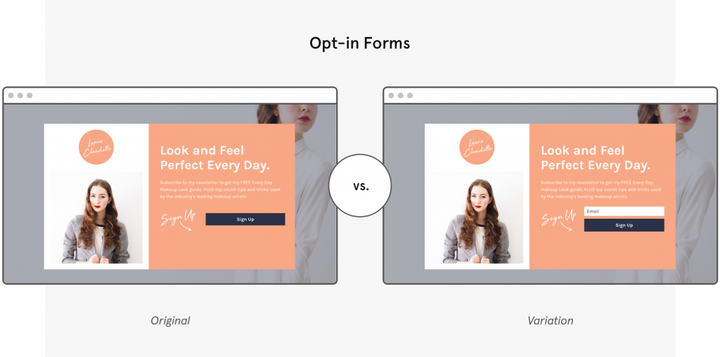
10. Always run an A/B Testing
Congratulations, if you have already done your landing page. It’s now the time to run an A/B test. With an A/B test, you can tie the success of campaigns to facts rather than guesswork.
A/B testing is a testing technique where you design two different versions of the same thing and test which version is working. The last but not the most minor rule to create a converting landing page is to have two versions of the landing page so that you can test and check which version works the best.
Here’s what you can do to test the two versions of a landing page,
- You can use different images
- Improve and edit the landing page copy or other elements
- Relocate the CTAs and change their texts
- Change the design elements to make the landing page more user friendly
- Choose a variety of opt-in forms, etc
- And, more!
Analyze the data, and compare and contrast the results to identify which works the best.
Let’s look into the two different opt-in forms to test a landing page,

Conclusion
Having a converting landing page for your product is important to drive leads and sales. A well-designed landing page can help you demonstrate your product in a much better way and communicate the message clearly to your customers.
Once you design and finalize your landing page keeping in mind the above 10 rules, make sure you run an A/B test to get the best results.